The short answer
A good Arabic app is not an English app flipped horizontally. Mirror only what shows direction, keep numbers, phone fields and Latin words left-to-right, give Arabic text room to breathe, write the copy in Arabic from day one, and test with real Arabic content on real phones before launch.
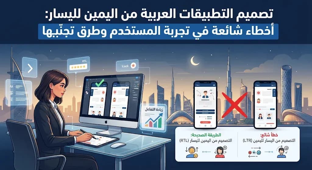
In the UAE and the wider Gulf, many users switch their phones to Arabic and expect every app to follow. When an app only half supports right-to-left (RTL) layouts, people notice within seconds: an arrow points the wrong way, a price splits in two, a button label gets cut off. None of these is a big bug on its own, but together they tell the user the app was not built for them. Below are the mistakes we see most often when reviewing Arabic interfaces, grouped by where they happen, with a practical fix for each.
Layout and direction: what to mirror and what to leave alone
The most common error comes in two opposite forms. Some teams mirror nothing, so the Arabic screen keeps an English layout with Arabic words poured in. Others mirror everything, including things that should never flip. The rule is simple: mirror elements that express direction or reading order, and leave alone anything that represents a real-world object or a universal convention.
Mirror in Arabic | Keep as is |
|---|---|
Back and next arrows, chevrons in lists | Your logo and other brand marks |
Progress steps and onboarding dots | Media controls such as play and fast-forward |
Side menus, tab order, list alignment | Clocks, checkmarks and charts with time axes |
Icons that imply movement, like a sent message or an exit door | Photos of real products and people |
Motion needs the same care. In Arabic, a new screen should slide in from the left, the back swipe should start from the right edge, and image galleries should advance in the reading direction. An app that mirrors its layout but keeps English-style transitions feels subtly wrong, even if users cannot say why.
On the development side, this is far easier when it is planned from the start. Use start and end layout properties instead of fixed left and right values. iOS, Android, Flutter and CSS all support this, so one layout serves both languages. Prepare icons in two groups from the beginning: those that flip and those that never do.
Text, numbers and typography
Numbers and Latin words that break inside sentences
Mixed-direction text is where most visual bugs hide. A price, an order number or a brand name written in Latin letters can jump to the wrong side of a sentence or split from its currency. The fix is technical: wrap these values with the correct direction markers in code so they stay intact. Then pick one price format per language and use it on every screen, from the product card to the receipt. Decide too whether the app shows Western digits or Eastern Arabic digits, use that choice everywhere, and accept both when users type into a field.
Arabic fonts treated like Latin fonts
Arabic script has tall ascenders, deep descenders and dots that need vertical space. Copying the English line height makes paragraphs feel cramped. Letter spacing, which designers often add to English headings, breaks the joins between Arabic letters and should be set to zero. Very thin weights become hard to read at small sizes, and animations that reveal text letter by letter look broken because Arabic letters change shape depending on their position. Choose an Arabic typeface that pairs well with your Latin one in weight and size, so mixed lines look balanced.
Buttons sized for English
The same label can be much longer or shorter in Arabic. If buttons, tabs and badges have fixed widths based on the English copy, the Arabic text gets truncated or wraps awkwardly. Build components that grow with their content, then test the longest phrase you have in each language on the smallest screen you support.
Copy and content
Machine translation is the fastest way to make an app feel foreign. The result is usually grammatically acceptable but stiff, and error messages are the worst affected. Write the interface copy in Arabic from the start, in clear Modern Standard Arabic that every Arabic speaker understands. A light Gulf tone can work well in marketing banners and notifications if it suits your brand, but keep core screens neutral. Store all text in separate language files so an Arabic writer can review it without touching the code.
Images matter as well. Stock photos and illustrations that ignore the local context weaken trust. Choose visuals that reflect your real customers, and check that any illustration with a sense of direction, such as a person walking towards a door, still makes sense in the mirrored layout.
Forms, dates and local details
Phone numbers: default the country code to +971 for UAE users, accept numbers with or without spaces and a leading zero, and keep the field left-to-right.
Email and verification codes: always left-to-right, even on an Arabic screen.
Names: accept Arabic and English names and do not force a strict first name and last name split. Many users prefer one full-name field.
Addresses: do not make a postcode mandatory. Addresses here usually rely on area, building and a map pin.
Dates and weeks: the UAE weekend is Saturday and Sunday, while Saudi Arabia uses Friday and Saturday. Start the calendar week in a way that suits your market, write dates in an unambiguous format, and plan for opening hours that change during Ramadan.
The store listing and testing
Many apps get the interface right and then publish an English-only page on the App Store and Google Play. Arabic-speaking users decide whether to download from that page, so give it Arabic text and screenshots that show the Arabic interface, not the English one with a translated caption.
Finally, never sign off an Arabic design that was tested with placeholder text. Test with real Arabic names, real prices, long addresses and actual error messages, on real iPhone and Android devices, in both languages. Repeat the test with enlarged system fonts, with a screen reader, and in dark mode.
A quick pre-launch checklist
Arrows, chevrons and transitions point the right way in both languages.
Prices and phone numbers display in the correct order on every screen.
Arabic text has no letter spacing and enough line height.
All Arabic copy, including errors and notifications, has been reviewed by a native writer.
Buttons and tabs fit the longest label in each language.
Phone, email and code fields stay left-to-right.
The store listing has Arabic text and Arabic screenshots.
Next step
At MetaGate, every app project includes a project study, identity and UI/UX design, development and testing before it is published on the App Store and Google Play, and Arabic and English layouts are designed together from the first screen. You can see how this affects scope in our guide to app design cost in the UAE, or read more about our mobile app development service. If you already have an app that feels translated, or you are planning a new one, book a free consultation with a business development expert and we will review the Arabic experience with you.